Thursday, December 16, 2010

An Updated Outlook on the Shanghai Index, Dr. Copper, and the Dow/Gold Ratio

Quietly, Chinese stocks continue to slide, now down 12% for the year to date.  Since China had announced its plans to target inflation, the Shanghai Index has taken it on the chin:

China Stock Market Price Chart 2011
Chinese stocks quickly retraced a portion of their 2008 losses - and then slowly faded. (Source: StockCharts.com)

Regular readers know that we like to follow China from a leading indicator point of view.  Chinese stocks topped before US stocks last time around, and also turned up about 3 months ahead in 2009.  We'll see that if the summer of 2009 top in Chinese stocks turns out to be a foreboding one too.

David Rosenberg writes today that the Shanghai index usually leads commodity prices by about 8 months (something I've wondered about recently):
In China, the Shanghai index was down a further 0.5% today and is now off 12% from the start of the year — and this index leads commodity prices by around eight months. Mizuho Research just published a report indicating that even with the government upping its inflation target, this is a sign of reality and not complacency. We are likely to see no fewer than six rate hikes next year out of the People’s Bank of China on top of the two increases this fall, no wonder the bank stocks there are peeling back.
Dr. Copper, though, disagrees with the bearish prognosis being inferred by Chinese shares - the metal with the PhD in economics continues its relentless ascent:

Copper Price Chart Outlook 2011

I never thought we'd see copper approach it's 2008 bubbly highs - but amazingly, here we are.  And it only took a few trillion newly minted dollars to do it!

Going forward, there are divergences all of the map - gold and silver are near new all-time highs, while most other commodities still lag their 2008 marks.  Bullish sentiment appears to be at or near a high water mark.  And to make things really exciting, interest rates are starting to pop across the globe.

A bet on higher stock prices is probably not an optimal one.  You likely have more upside and less downside by just buying gold straight up.  Since a bet on rising stock prices is really a bet on inflation, why not just go straight to the proven inflation hedge?

Gold Dow S&P Ratio Price Chart
The Gold/Stocks Ratio is still in an uptrend in the US.

Of course regular readers know that short-term, I don't really like either - because the dollar is starting to look frisky again.  If the buck does rally, that'd probably be bad for stocks, and somewhat less bad for gold (which is breaking out against most other currencies).

So once again, the "short stocks, long gold" trade is probably the one to be in for at least a few more years.

Gold Supply Graphs and Analysis: Why the Price is Setup to Keep Climbing in 2011

Here's a nice piece of analysis from Jeff Clark, who breaks down the supply situation for gold, and makes a compelling case that gold should keep climbing higher in the years ahead.  Jeff draws some interesting comparisons with the peak of gold's last bull market as well, to show that we potentially have a lot of room left to run.
----
Gold, Get It While You Can
By Jeff Clark, BIG GOLD

We've got it easy right now. Click or call, and you can quickly and conveniently own a gold coin or bar. But if global concerns cause another panic or the dollar breaks down, you could find yourself standing in a line at the local coin shop or getting a busy signal. Simply, for reasons I’ll discuss here, you may find it very difficult to get your hands on physical gold when that time comes.

It's happened before. Though there were no precious metal ETFs in 1980, the demand for physical gold was so great that you literally had to wait in line at a coin shop to buy, with plenty of occasions when you would have been turned away due to lack of inventory. And you'll recall we saw serious shortages, unexpected delays, and soaring premiums in late 2008.

Given the fragile state of global affairs and the waiting-in-the-wings crisis for the U.S. dollar, I'll be surprised if we don't see another panic into physical gold. And the question is, will there be enough metal to go around when the public – 95% of which own none – wakes up and wants to buy it?

Answer: No.

Contrary to some claims, it isn't because we're about to run out of supply. While global mine production peaked in 1999 at 82.1 million ounces and has trended down since, take a look at the second largest source of supply – scrap. As you would expect, bad economic times and the surge in gold prices have triggered an increase in supplies from that source.


In fact, since 1999, as the price of gold climbed, the scrap supply nearly doubled. (Scrap comes mostly from jewelry, 75% of which derives from India, East/Southeast Asia, and the Middle East.)

So when you examine the total supply of gold coming to the market, it’s actually nudged up for three consecutive years, hitting 116.6 million ounces in 2009, a modest 8% increase over 1999. In the greater scheme of things, the total supply of gold to market has changed very little.

So what’s the problem?

First, you’d think a higher gold price would lead to rising mine production – but that’s not happening. From 1999 through 2009, the average annual gold price rose 248%, yet gold production fell 6.6%.

This means that as gold continues higher, we cannot count on miners producing more yellow metal for us to buy. This concern will become increasingly obvious as more buyers enter the market.

Second, although scrap has more than supplemented the fall in mine production, as I’ll show you in a moment, it’s still not enough to fully satisfy current demand, let alone any increase in buying.

Meanwhile, the third major source of gold supply is reversing trend. Until last year, central banks around the world had been selling gold, adding a reliable tributary to the flow of metal year after year. This has stopped. As recently as 2007, 17 million ounces came to market from central banks; last year they acquired 7 million ounces. The era of central banks as large net gold sellers has likely ended.

The conclusion we can draw from these signals is clear: known gold supply conduits will not deliver any significant new supply in the future. This will have serious repercussions. While it’s certainly bullish for the price, I think many investors have overlooked a critical angle:

If more and more people want to buy gold and the supply doesn’t increase, what happens to your ability to get it?

You can’t turn a profit if you can’t own it.

Realistically, though, how much more demand can we expect?

One way to estimate this is to compare today’s percentage of global assets in gold to the last great bull market.


While gold’s share of the global financial landscape has grown since 2001, a whopping 385% leap is needed to equal its 1980 peak.

Certainly some of that percentage could result from a decrease in the value of other assets. For example, residential and commercial real estate values will continue to fall as bad loans are unwound, and stock markets will adjust lower as global economies slow from cutbacks in government spending. But the gap is so enormous that investment in gold could easily increase significantly before this bull market is over.

Another way to measure potential future demand for gold is to look at today’s investment and coin demand compared to the last bull market. The following chart first looks at what portion investment in gold comprises of the total uses for gold (i.e., including jewelry and industrial uses). Then we look at the percentage coin buying represents today vs. the peak in 1979. The point is to see if we’ve already reached high investment levels in gold similar to the last bull market peak – or if there’s room for more.


When investment demand for gold (physical metal, ETFs, bank buying, etc.) peaked in 1979, it represented 54% of all uses for gold that year, a far cry from last year’s 32%. Of course, this is just arithmetic; lower jewelry demand could make investment demand look bigger as a share of total demand. But this data makes clear that an increase in investors wanting more gold could rise dramatically.

The picture is more striking when we look at coin demand. Coin buyers represented 36% of all gold investments in 1979; today it’s barely 14%. Coin demand would have to grow by 157% to match the last bull market peak. Yes, gold ETFs have and will continue to replace some of the demand for physical metal, but this shows there remains tremendous room for growth for investors wanting more gold coins.

Based on this data, I believe that despite the strong demand for gold investments we see today, it can go much, much higher in the coming years.

Here are some examples of coin demand straining current supply that you may find surprising....

The Rand Refinery in South Africa, the world’s largest, forecasts it’ll sell 1 million Krugerrands this year. Sounds like a lot – until you consider that from 1974 to 1984, they sold 2.6 millionounces per year. And that was when the world’s population was roughly 35% lower than today.

The U.S. Mint has had difficulty meeting heightened demand when annual sales are only slightly above historical averages.

So far this year, gold production in China is up 5%, but demand for physical gold is up 30%.

During two tense weeks of the Greek crisis in April/May, the Austrian Mint, one of the world’s five largest, sold a quarter-million ounces, an amount that exceeded all of first-quarter sales. And Pro-Aurum, one of Europe’s largest online precious metals traders, had to temporarily suspend sales due to a backlog of orders and insufficient supply. If Greek-style sovereign debt fears spread to other nations – something looking all but assured – rolling bullion shortages could resurface.

While all this is bullish for the price of gold, it’s alarming what it suggests might happen to the availability of physical gold.

So my question is this: if the dollar is collapsing and gold is screaming to $5,000 an ounce, will you feel like you own enough?

Better get some now while you still can.

----

At the just-concluded Casey’s Gold & Resource Summit, dozens of resource experts and seasoned investment pros talked about gold and gold investments as an integral part of any crisis-proof portfolio. Listen to the in-depth advice of John Hathaway… Eric Sprott… Richard Russell… Doug Casey… Ross Beaty… Rick Rule… including their top stock picks of the year. Learn more here.

Ed. Note: I am a Casey Research subscriber and affiliate.

Monday, December 13, 2010

Why You Should Consider Shorting Crude Oil Right Now (Hint: Record Long Bets)

Over the longer haul, many of us believe that oil is heading higher.  If you subscribe to the peak oil theory, or at least some derivation of it, this trend is basically regarded as fact.

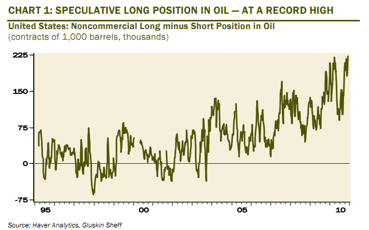
But for the shorter term, oil may be due for some degree of pullback.  Speculative longs on the black goo is at an all-time high, according to our boy David Rosenberg.  From today's Breakfast With Dave:
We remain long-term secular bulls on commodities, but as the charts below reveal, the net speculative position in gold, oil and copper are far too high right now for comfort. Oil is at a record high in terms of speculative net longs on the New York Mercantile Exchange.
Net Speculative Long Position in Oil
Source: Haver Analytics, Gluskin

Surely, this is because crude is breaking out to new all-time highs, right?  Ummmm, no.

Crude Oil Price Chart 2008 2010
While bets on crude going up are at an all-time high, the actual price of crude is still way off 2008 levels. (Source: StockCharts.com)

Peak oil crowd, beware - if you're making long bets on crude right now, you're not alone.

How to Invest Alongside Richard Russell: Get Into Gold Before the Mania Phase

Richard Russell recently went on record as saying that gold has not yet hit the third - and most lucrative - stage of its current bull market: The Mania Phase.  Casey's Andrey Dashkov agrees, and makes the case that you should use this opportunity to pick up some gold junior miners before things really get out of hand.
----
Chart of the Month: TSX-V Speaks Volumes - Gold Mania Still Ahead

by Andrey Dashkov, Casey’s International Speculator

With the gold price hitting nominal highs last month, there is a lot of “mania” and “bubble” ranting going on in the gold community. Should we start selling?

A bull market typically progresses through 3 phases: the Stealth Phase, in which early adopters start buying; the Wall of Worry Phase (or Awareness Phase), when institutions begin buying and every significant fluctuation makes investors worry that the bull market is over; and the Mania Phase when the general public piles on, driving prices beyond reason or sustainability.

This is followed by the Blow-off Phase, when the bear takes over from the bull and the herd gets slaughtered. Judging by the volume on the TSX Venture Exchange (TSX-V), where a lot of gold juniors are listed, we conclude that the next phase of our current gold bull market, the Mania, still lies ahead.

Have a look at the chart below:

Click to enlarge

If a mania were unveiling now, we would expect to see a sharp increase in investment capital entering the TSX-V, driving its trading volume upward. Over the last few months, the TSX-V daily volume has spiked upward sharply, but as the chart clearly shows, short-term volume is extremely volatile, spikes are common, and equally large drops are just as common.

Stocks of junior exploration companies are leveraged to gold, meaning they rise or fall by a greater percentage than does the yellow metal itself. So a spike in volume should be expected in reaction to an ascending gold price. A more reliable barometer is volume’s 10-period moving average that removes interim market gyrations. Using this measure, the TSX-V’s volume looks like it has returned to a slope of ascent similar to before the 2008 market crash, and the longer-term trend is steadily upward – steady being the key word.

More investors are entering our market, but the pace is not yet accelerating greatly, as we’d expect in a true Mania Phase. In other words, an early indicator of the mania in this bull cycle will be a sustained parabolic move upwards in the TSX-V’s average volume. And that is not happening yet.

Our other volume indicator, the GLD gold ETF, behaves in an interesting manner: it frequently moves counter to the TSX-V. An explanation for this might be that GLD is considered a “blue-chip” stock; a safer haven for investors who actively trade on the TSX-V and park their cash in GLD during periods when they consider juniors overly risky.

The moving average of GLD’s volume remains on a moderate multi-year ascent but has turned down recently. However, its daily volume is up in recent trading. Given the observed correlation between trading volumes of the TSX-V and GLD, this may point to a cooling-down in TSX-V trading activity in the near term.

Finally, the ^HUI gold miners index has tracked TSX-V volume as well, also having resumed a slope of ascent similar to that of the years before the 2008 crash. We see this as another indication that we are in an accumulation phase of the bull market.

We will continue tracking these parameters and updates when we see significant changes. For now, the bottom line is that even with the gold price moving sharply higher, the mania remains an anticipated future event.

----
[But when the Mania Phase does hit, there’ll be no stopping it. And the best leverage – beating the S&P 500 by more than 8 times – comes from the little-known “gold nuggets” that International Speculator editor Louis James keeps digging up for his subscribers. For a very limited time, you can save $300 on the annual subscription fee – plus receive Casey’s Energy Report FREE for a year! To learn more, click here now.]

Friday, December 10, 2010

Why Natural Gas is Set to Soar in 2011 (Hint: Oil-to-Nat Gas Ratio is Out of Whack)

Natural gas is starting to get some contrarian love as a possible hit in 2011.  It's price action is starting to look favorable, as it looks like "The Natty" has finally put in some sort of bottom.  For a look at oil and gas fundamentals - including the important oil-to-natural gas ratio, here's our energy guru Marin Katusa for a look...
----


Where Are Oil and Gas Prices Heading Next?
By Marin Katusa, Chief Energy Strategist, Casey Research

Oil is heading to US$200 per barrel. This isn’t speculation but hard fact. But forewarned is forearmed, and with this price expected within the next five years, investors have plenty of time to position themselves.

We recently have been talking about tools that investors can use to navigate the economic landscape. The gold-to-oil ratio is one such tool, but another popular compass is the oil-to-natural gas ratio.

The oil-to-natural gas ratio relates more to nuances within the energy complex, rather than the gold-to-oil ratio, which relates to monetary values. It’s the WTI Cushing price of crude oil per barrel to the Henry Hub Spot Price for natural gas per million thermal units.

In theory, based on an energy equivalent basis, crude oil and natural gas prices should have a 6-to-1 ratio. Market characteristics, however, have dictated that since 2006, the price of oil follow a pattern of 8-12 times that of natural gas.

As the chart below shows, historically the oil-to-gas ratio from 1990 to 2008 was in the low 9s. This means one barrel of crude oil was equivalent to about 9,000 cubic units (Mcf) of natural gas.


Improved drilling techniques and access to immense shale gas fields across the country have seen a boom in domestic gas production. Nor can gas wells just be shut down willy-nilly. The complexities of a gas well mean that it takes anywhere between three to six months to shut down operations.

And while the number of rigs sprouting up each year is decreasing, natural gas production is on the rise, with many of the shale wells coming online with their sources fresh and untapped.

Thanks to this flood of shale gas, the oil-to-gas ratio has risen to almost 17 on average. That is, one barrel of oil is now worth 17 Mcf of natural gas (17,000 cubic feet of gas)!

When we defined the oil-to-gas ratio, we used the term “thermal units.” It is interesting, then, that based on thermal units, one barrel of oil produces as much energy as roughly 6 Mcf of natural gas. So from a financial perspective, the oil-to-gas ratio is very different than in terms of energy.

Some companies and analysts use this disparity to their advantage, using the 6 instead of the 17 value to come up with the “barrels of oil equivalent” conversion for the value of gas. That’s a fudge factor of 2.8!

It’s an accounting mechanism that’s been turned into a completely legal but very shady promotion mechanism, one we watch for carefully.

It’s worth knowing that things can change very rapidly in the natural gas market. We do believe, though, that the current trend will continue for years to come, with the oil-to-natural-gas ratio ranging between 15 and 20.

For long-term investors, the oil-to-gas ratio is indicative of a paradigm shift in the markets. It is yet another tool in our collection of crystal balls for the economy and, if read correctly, is a great way to add some valuable holdings to a portfolio.

(Fortunately, you don’t need a crystal ball to profit from energy. All you really need is a subscription to Casey’s Energy Report, which you can try for three months, risk-free, by clicking here now.)

Ed. note: I am a Casey Energy Report subscriber and affiliate.

Most Popular Articles This Month